Project Pivo 2 0.4.2-a — UI Polish & Fixes
A focused quality release, Overseer — no new systems this time, just a sweep to make the colony interface sharper and friendlier on a phone.
Improvements
Mail, rebuilt for phones. In portrait the inbox now fills the entire screen instead of splitting it with a half-empty preview pane. Tap a transmission and it opens full-screen with a clear < INBOX back button; on tablets and PC the familiar side-by-side list-and-reader view is unchanged.
Clearer military readouts. The Units column header now reads unassigned over total owned, lining up with the roster total in the stat tile above it instead of mixing in your cap. The Attack stat also gets its own warm-orange accent — it previously shared the red "danger" colour of the Disband button, which made a healthy army look like an error.
Marketplace header breathing room. The marketplace level and caravan-capacity readout in the top-right of the resource bar was crammed against the resource columns; it now has proper spacing and a cleaner divider.
Fixes
No more empty boxes in the interface. After a recent font change, several panels — building info screens, Marketplace listings, dropdowns and timers, world-map resource nodes, and the attack screen — drew little empty squares where arrows, stars, check-marks, and the trade swap-arrow should have been. Every one of those symbols now renders correctly.
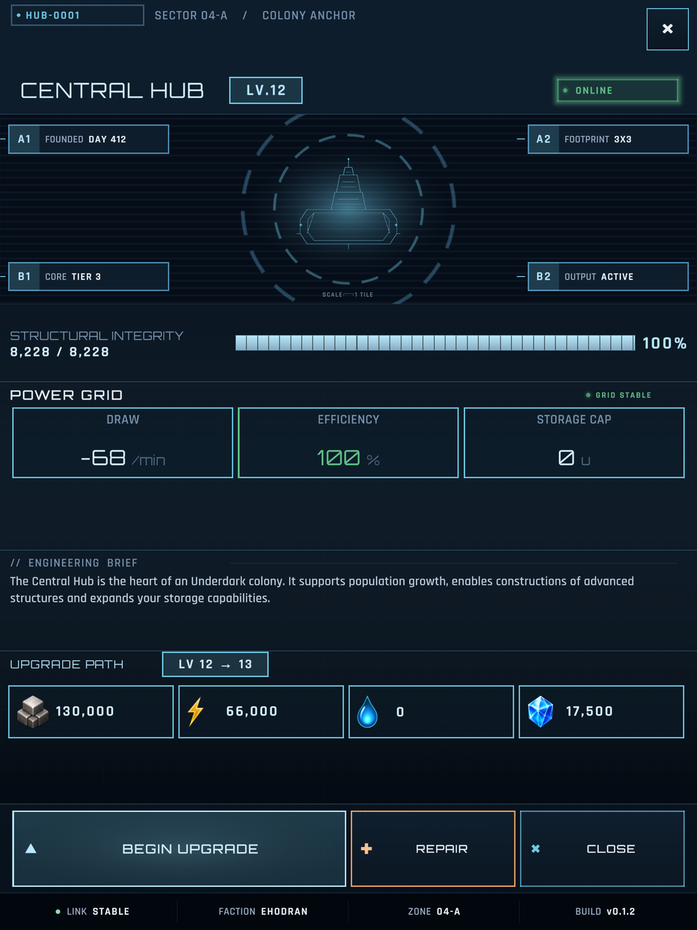
Building info panels render crisply - clean text and icons after the font fixes.
Tutorial stays where it belongs. Opening the world map partway through the first-build tutorial could leave its welcome card stuck on screen over the map. It now tucks away when you leave the city and returns when you come back — and the SKIP button is larger and easier to read.